Usability testing, user research, and heuristic reviews can seem daunting and sound expensive, but they don't need to be.

Our UX experts recognized a pattern: many times a poor user experience is the result of a lot of small, but easily identifiable issues. Once identified, fixing these issues isn't complicated or time-consuming. We realized that if we pointed out the low hanging fruit and suggested some quick-fixes, people would be able to immediately improve their site usability.
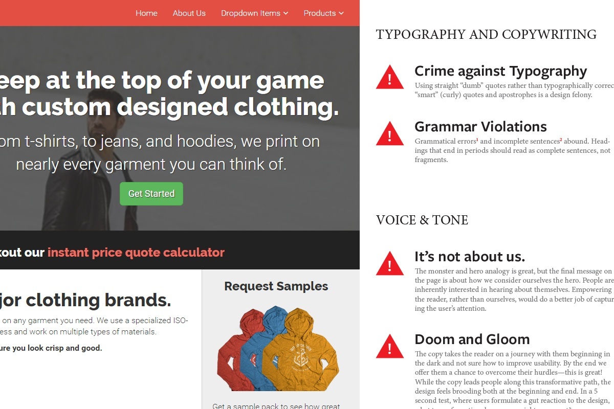
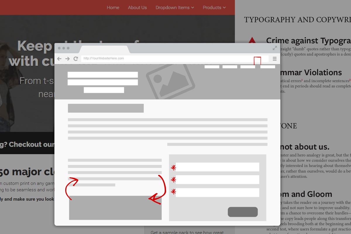
You'll get a comprehensive review of your website, pointing out any problems with performance, navigation, interface design, and content that we uncover. We'll be measuring your site against usability heuristics and industry best practices to help you eliminate key pain points.

We focus on providing you with actionable feedback—as long as you have the ability to edit content, control your site menus, and update basic formatting the recommendations we make should be easy for you and your team implement.

Although you'll get plenty of ammunition to deal with the small stuff, we may uncover underlying problems that have an equal or greater impact on user experience. For the big stuff, we'll outline a plan of attack, detailing critical issues in order of priority and providing a roadmap to address them.
